Ericc B
Well-Known Member
- Thread starter
- #1
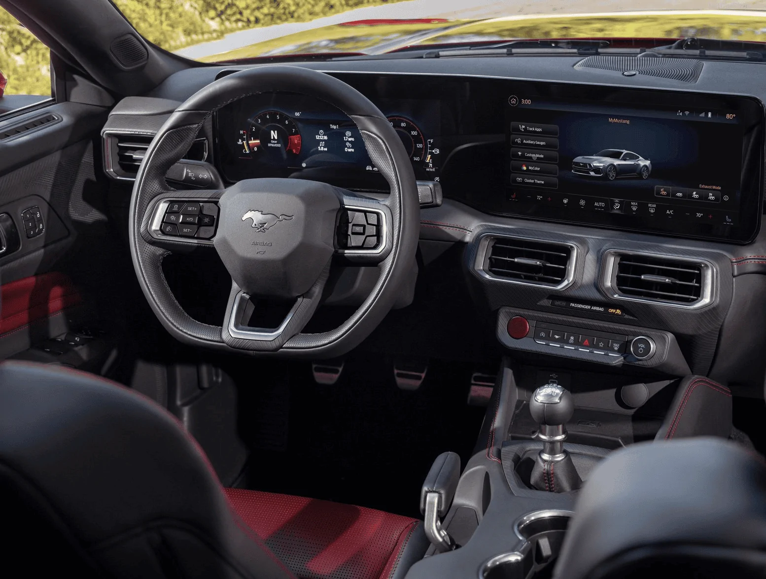
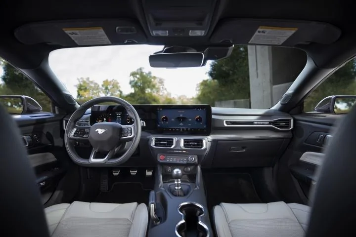
Okay, now that I got your attention, I think it's time to discuss the massive misstep that Ford has made with the S650 - which is the new dashboard.
Personally I think it is atrocious. It has completely ruined one of the key elements that makes a Mustang interior a Mustang and makes it look like any other Mercedes, BMW or Korean SUV.
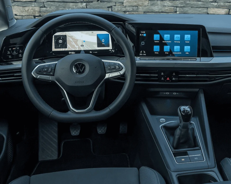
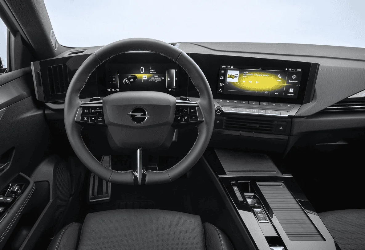
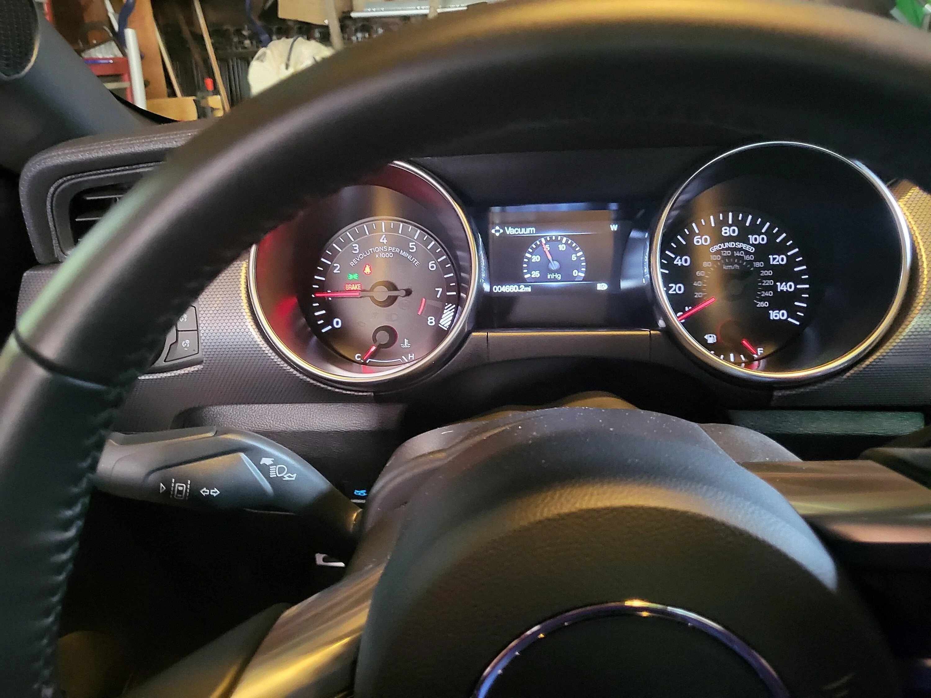
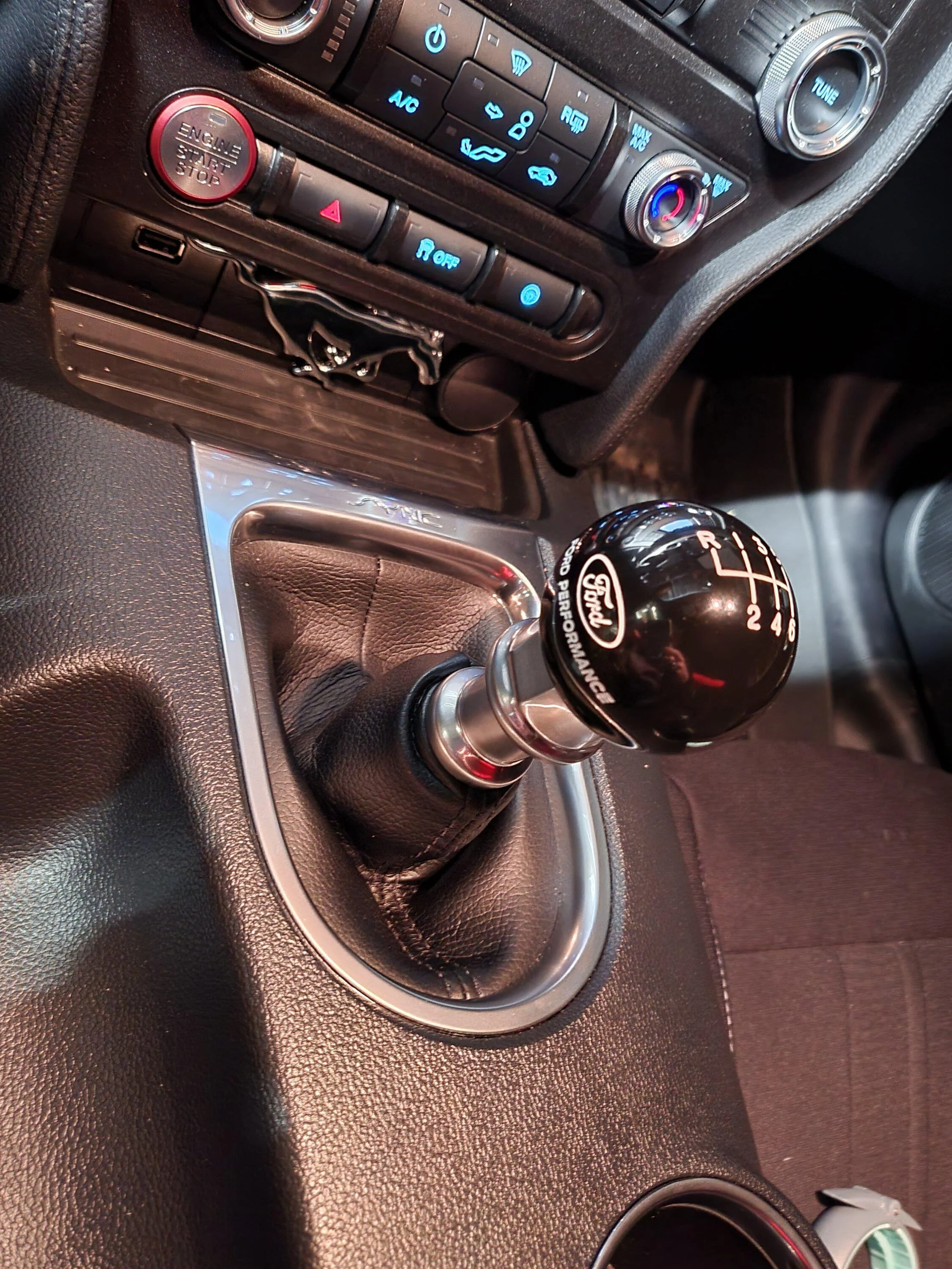
Now I know that it's the industry trend, everyone is doing it, idiot millennial consumers can't live without it, bla di bla. But the fact to the matter is that this is supposed to be a Mustang and a Mustang has very distinctive design characteristics. Characteristics that Ford marketing brass can't stop talking about when it comes to praising the new design. So why in the world did they feel the need to do away with one of the most important of those very characteristics, which is the beautiful symmetric double brow dash? This is completely wrong. It serves no purpose other than cutting costs on HVAC and other switch gear, and one switch at a time it destroys ergonomics and makes the car unsafer to operate.
It is not out of the blue that other brands who started this stupid fad (like Audi) and who were criticized from day one on the ergonomic repercussions are already reversing this policy and bringing physical switches back in their latest releases. Ford however is running at the back of the field and wasting their time on fancy graphics for switching drive modes, instead of designing an even better positioned toggle switch.
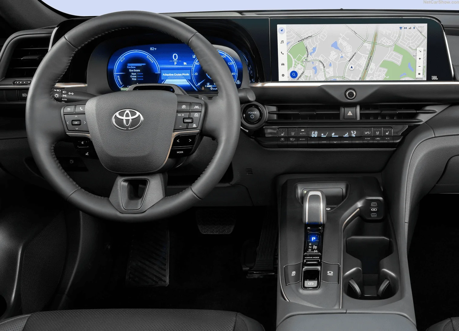
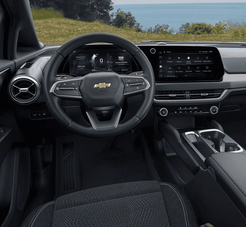
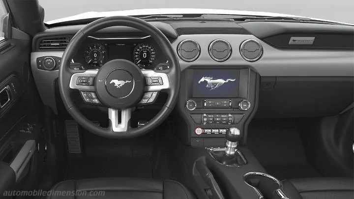
No Mustang driver needs a massive tablet in their car. When you drive a Mustang you are concentrating on driving, on the road and your surroundings. The nicely integrated Sync2/3 screen of S550 did the job perfectly well. In the Mach-E they even did a wonderful and creative job on integrating a soundbar in the double brow, a truly innovative piece of design progress. But instead of bringing that into S650 we get this generic dud and now have to live in a world where Mach-E has a more true to Mustang dashboard that the real Mustang.
This is a disaster.


Personally I think it is atrocious. It has completely ruined one of the key elements that makes a Mustang interior a Mustang and makes it look like any other Mercedes, BMW or Korean SUV.
Now I know that it's the industry trend, everyone is doing it, idiot millennial consumers can't live without it, bla di bla. But the fact to the matter is that this is supposed to be a Mustang and a Mustang has very distinctive design characteristics. Characteristics that Ford marketing brass can't stop talking about when it comes to praising the new design. So why in the world did they feel the need to do away with one of the most important of those very characteristics, which is the beautiful symmetric double brow dash? This is completely wrong. It serves no purpose other than cutting costs on HVAC and other switch gear, and one switch at a time it destroys ergonomics and makes the car unsafer to operate.
It is not out of the blue that other brands who started this stupid fad (like Audi) and who were criticized from day one on the ergonomic repercussions are already reversing this policy and bringing physical switches back in their latest releases. Ford however is running at the back of the field and wasting their time on fancy graphics for switching drive modes, instead of designing an even better positioned toggle switch.
No Mustang driver needs a massive tablet in their car. When you drive a Mustang you are concentrating on driving, on the road and your surroundings. The nicely integrated Sync2/3 screen of S550 did the job perfectly well. In the Mach-E they even did a wonderful and creative job on integrating a soundbar in the double brow, a truly innovative piece of design progress. But instead of bringing that into S650 we get this generic dud and now have to live in a world where Mach-E has a more true to Mustang dashboard that the real Mustang.
This is a disaster.
Sponsored
Last edited: