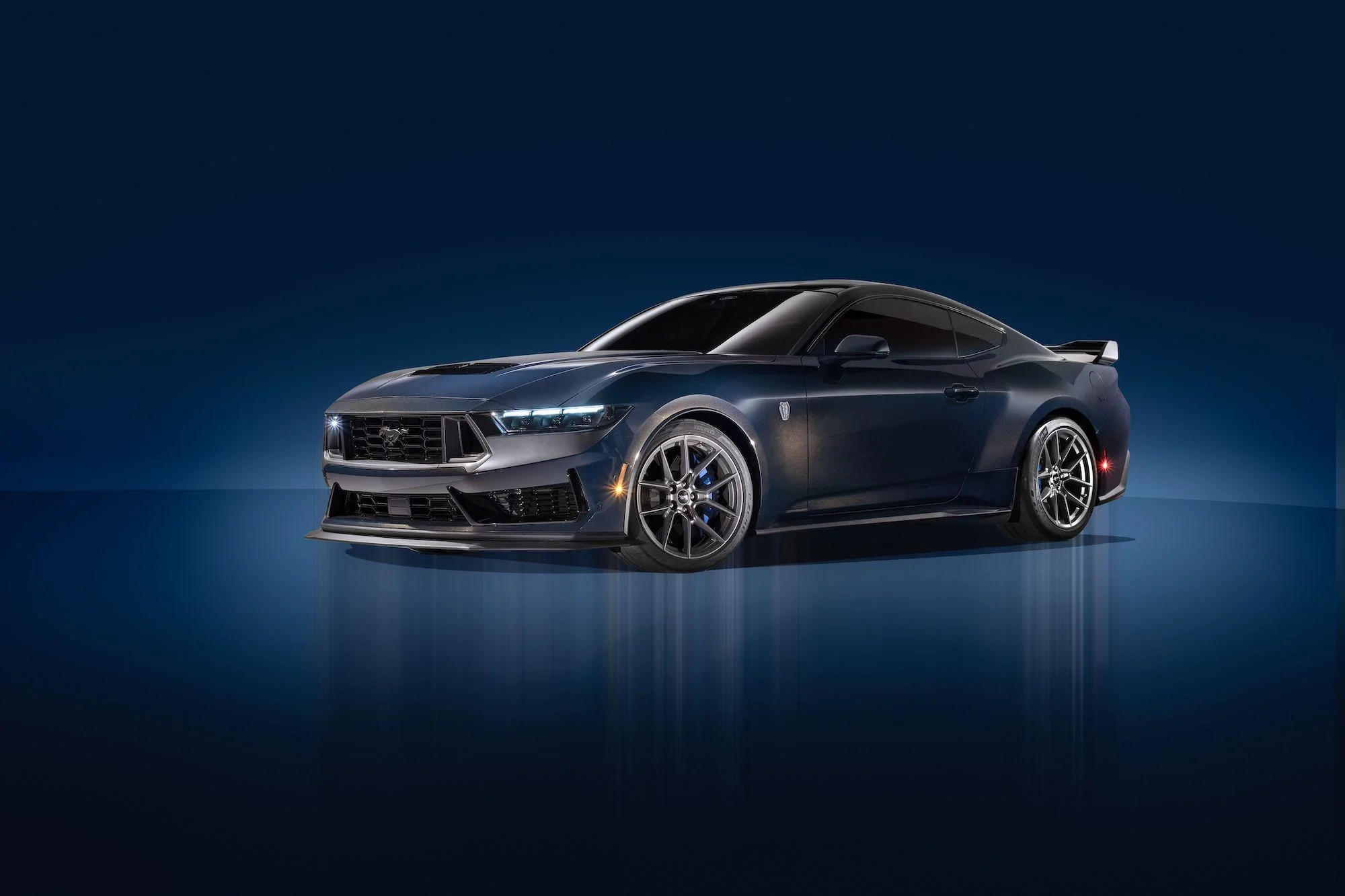
More specifically, what's pictured is the dark horse with handling package correct? Not even the base dark horse. Or am I wrong? Also somewhat confused.
The pictures are labeled incorrectly in this post.
You have "DARK HORSE S" and then show a bunch of pictures of the regular Dark Horse.
The "S" model is the same as the Boss 302S or the FP350S - track only. The "R" is just serialized for actual competition. Not trying to be rude, just didn't want people getting confused.
DH is a "limited" production car? Not what I wanted to hear, as I am not in the market for one until roughly 2028. Hopefully it will be more like the GT350 production run, then.
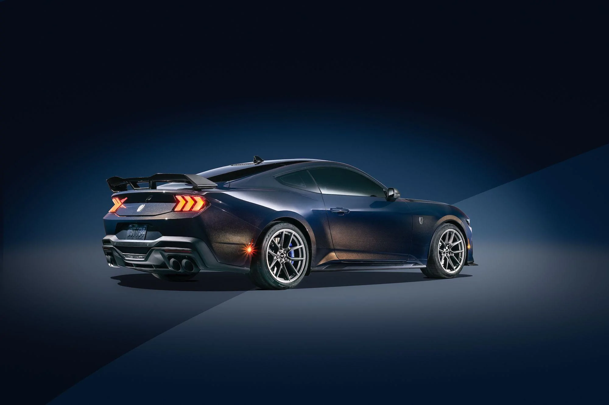
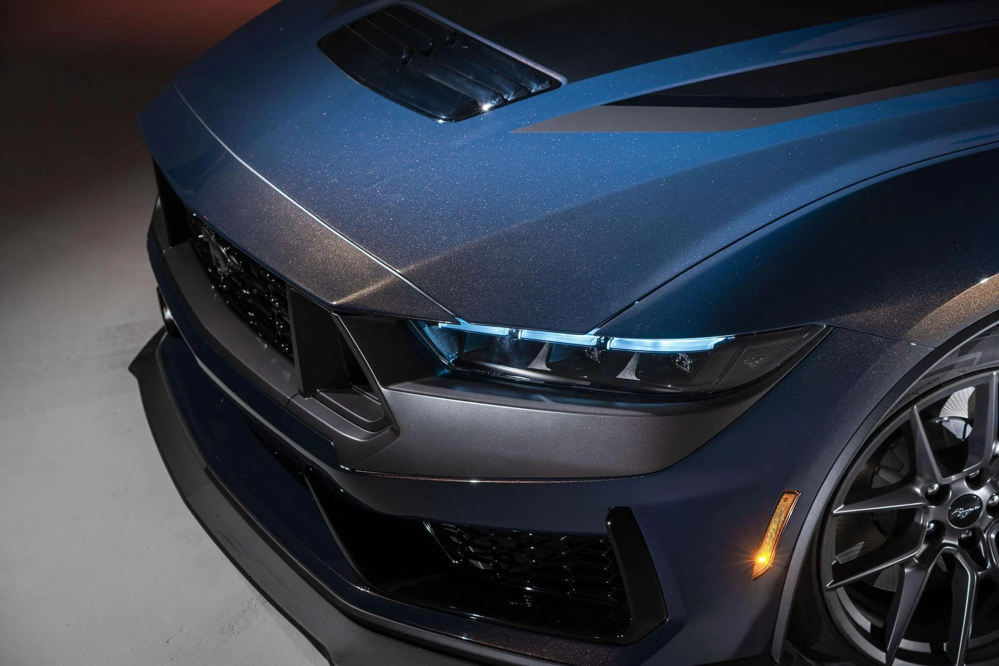
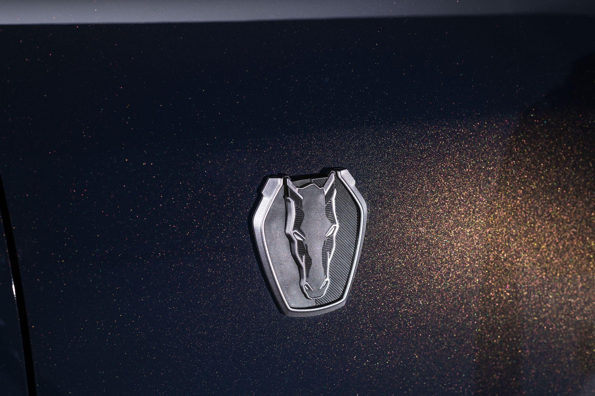
i would have to remove the new "emblems" from mine if i ever get one....something about them doesnt scream mustang to me. i get they want to create something different but just cant get behind them.
i would have to remove the new "emblems" from mine if i ever get one....something about them doesnt scream mustang to me. i get they want to create something different but just cant get behind them.
i put decepticon stickers on my mustangs...you have to look for them. but no i do not like this one.
i guess im old school, give me the tri-bar pony all day and im good. i get the idea behind it but thats it. maybe something else could have worked but when you do a full frontal of a horse there is not much "attitude" in that picture. does anyone remember the old logo CJPony used to use...the horse head breathing out of its nose....that looked mean...as if it was ready to charge.
this one looks like its in a stable saying hi to you. maybe if they would have not made it "tranformery" it might have looked ok....but i guess for the car with all the "tech" and robotic features sure it works...
Ha, I was being facetious. To add to what you’re saying, the reason the tri-bar, galloping pony, and the Shelby badging all look good is because they actually look ornate. Like sophisticated pins. This looks like a silver blasted decorative sugar cookie.